Friday, November 12, 2010
Chosen Artist
I found Aaron Dysart's work very interesting. I like the wood work and how he changes these images. I could imagine almost any of his images to be works of art around households/buildings/anything that wants to use nature as a decor. I have always liked using sticks or wood as decor in my house for example and i really liked the Aaron's "cut" that he had at the gallery at school. The way he changed the edges and made the piece look very clean and cut. Could really use his work for any occassion really. Could be used in any instance and that i guess is why i liked it so much. Its different compared to the rest. Not something that you see or look at on a daily basis. Not really considering that wood is art. But it really is. And Aaron protrays that well. I would recommend anyone to check out his work.
Thursday, November 4, 2010
another tower

Redid some one of my photos only because i wasnt happy with my other picture of the Foshay because it ended up turning out very pixilated so i changed it up a bit and came up with this. Overall not too shabby.
Thursday, October 28, 2010
foshay towers


with different aspects and colors I over all enjoyed it and am happy with the outcome.
Thursday, October 14, 2010
RESPONSE!
I found it very interesting when they mention about how arguements are somehow re rooted twards war. Like our conversations/arguments or the way we use are words are related to war. I have even used the concepts either when i have been angry or when i have been in some sort of conflict with another person or explaining to a friend about how I feel about something.. Like the first chapter mentions it becomes or has become so common for us to talk that way that we dont even think about it any more.
As the book says our language is metaphorically structured and i agree with that. They proved it to me by giving examples of conflict with concepts of both war and language. Becuase we automatically defend and attack the other person. Now most of the time this does not happen physically its all mentally. The book gives some great examples.
As the book says our language is metaphorically structured and i agree with that. They proved it to me by giving examples of conflict with concepts of both war and language. Becuase we automatically defend and attack the other person. Now most of the time this does not happen physically its all mentally. The book gives some great examples.
makeover move poster

Monday, October 11, 2010
new business card

Thursday, October 7, 2010
15 artists....
1~Ewa Wnek Webb: Amazing color in her paintings and the texture/feeling behind the images are awesome.
2~Michael Alford: I have always been a fan of landscape paintings and he captures the feeling as if you were standing right there in the painting itself.
3~Angela Filo: Creates much depth in her photos
4~Kristin Giordano: amazing photos that has a stillness and creates depth with meaning
5~Karin Muller: has a specific photo in particular that is of a shoreline with fog above. It is amazing how she captured that one moment so well.
6~Chris Jorda: Expresses mass media in one picture and us as a society are today by displaying a huge amount of cell phones scattered about.
7~kosoff: black and white pictures that he has taken are astounding
8~Jim brandenburg: many animals especially loons but the clarity of the photo is just amazing.
9~Sally Gail~very contemporary but seems to find a way to connect human with nature.
10~Kelly Fitzgerald: another landscape artist that i'm very fond of. Really captures the size and dominance of nature.
11~Sandra Russell: Love the color in her photos. As if she used sepia: she makes them look very romantic
12~Alan Shulik: Very unique, does more combonations between organic figures with architecture.
13~Stephen Johnson: Does mountains with ice and percieves dephth and curiousity in all of his photos.
14~Mark Citret: Very elegant with his paintings. Very 19th century.
15~Bill Schwab: shows a lot of balance in his photos.
The SAYING:
"Don't worry about your originality, you could not get rid of it even if you wanted to." by Robert Henri

Friday, October 1, 2010
REDO!

Wednesday, September 22, 2010
Movie Poster

Wednesday, September 15, 2010
Escape to Freedom

I orignally was going to pick something funny but decided to go with something more serious. I have this book called What Would You Do If You Had No Fear? by Diane Conway. I have read the book in the past and I remember it because it is a really inspiring book about life and how you shouldn't be afraid to take any chances in life. And i do believe that very much. I created this picture by distorting an image of a lion to make the image more intense. I chose a saying that is from To Kill A Mockingbird by Harper Lee. I think the saying tells you that courage is not what everyone thinks or what we made it out to be. Courage is what you make it. I chose a more faded font that almost becomes apart of the picture because the lion in itself, I believe shows COURAGE.
Wednesday, September 8, 2010
not so good
Found this movie poster and found it very boring. When you look at it seems like any other type of ocean movie with sharks. They could have done a lot better. With all of the same color and not much for the viewer to think about.
http://www.best-horror-movies.com/image-files/open-water-2-movie-poster.jpg
http://www.best-horror-movies.com/image-files/open-water-2-movie-poster.jpg
Good
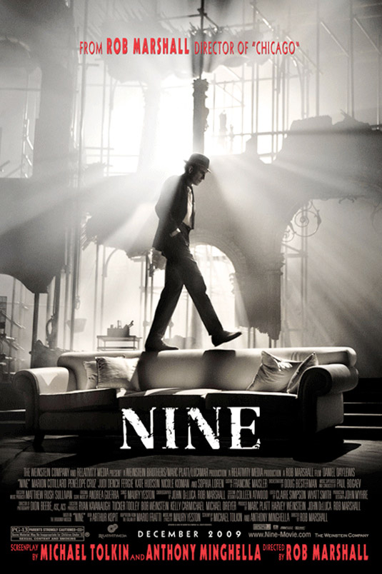
Found this poster when I was mostly snooping around google and came across this. I find this most amazing because of the black and white contrast. And how the light seems to be shining through the windows from the backround. This one caught my attention the most because I want to know what it is about by the way this poster looks. With the red color usage that they used at the top it makes the poster more dynamic. Red, black and white are one of the best color combonaitons. Even though they are not that bright they make the loudest statement. This poster is simple yet complicated at the same time and to me that is what makes it awesome. I think they did really well with this because it is well put together with not alot in the back round.
Thursday, September 2, 2010
awesome post
Found this awesome blog spot that talks about and teaches you how to make amazing looking birthday cakes or for any occasion! GOTTA CHECK IT OUT!! All I have to say is A-Mazin!
http://elegantcakesandpartydates.blogspot.com/
http://elegantcakesandpartydates.blogspot.com/
Me in a NUTSHELL

Subscribe to:
Posts (Atom)