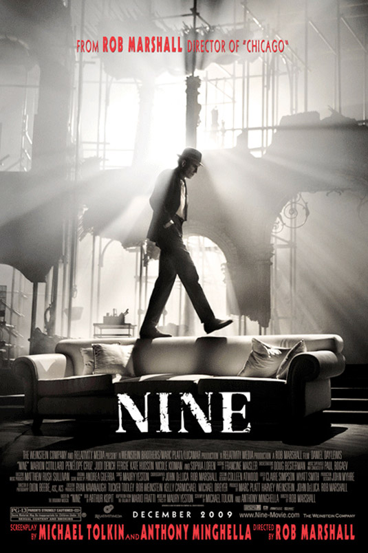
Found this poster when I was mostly snooping around google and came across this. I find this most amazing because of the black and white contrast. And how the light seems to be shining through the windows from the backround. This one caught my attention the most because I want to know what it is about by the way this poster looks. With the red color usage that they used at the top it makes the poster more dynamic. Red, black and white are one of the best color combonaitons. Even though they are not that bright they make the loudest statement. This poster is simple yet complicated at the same time and to me that is what makes it awesome. I think they did really well with this because it is well put together with not alot in the back round.
No comments:
Post a Comment